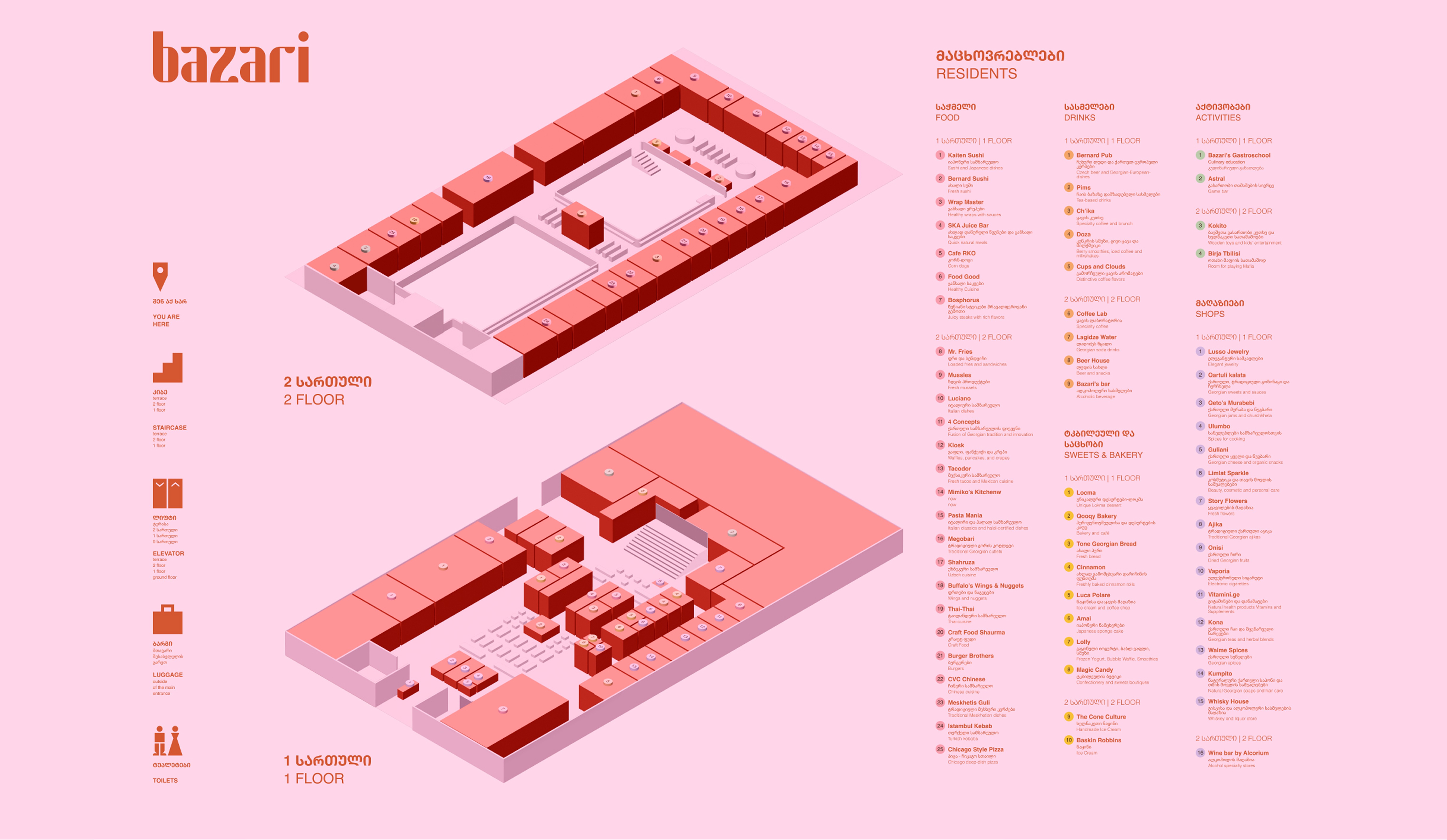
Brand Identity and Wayfinding for Bazari
Branding / Visual Identity / Wayfinding
2024

01/
Overview
A new identity and visual strategy for Bazari Orbeliani, built to bring together the city's best gastronomic offerings, cultural experience, and community spirit — for locals and tourists alike.

02/
Rebranding & Identity
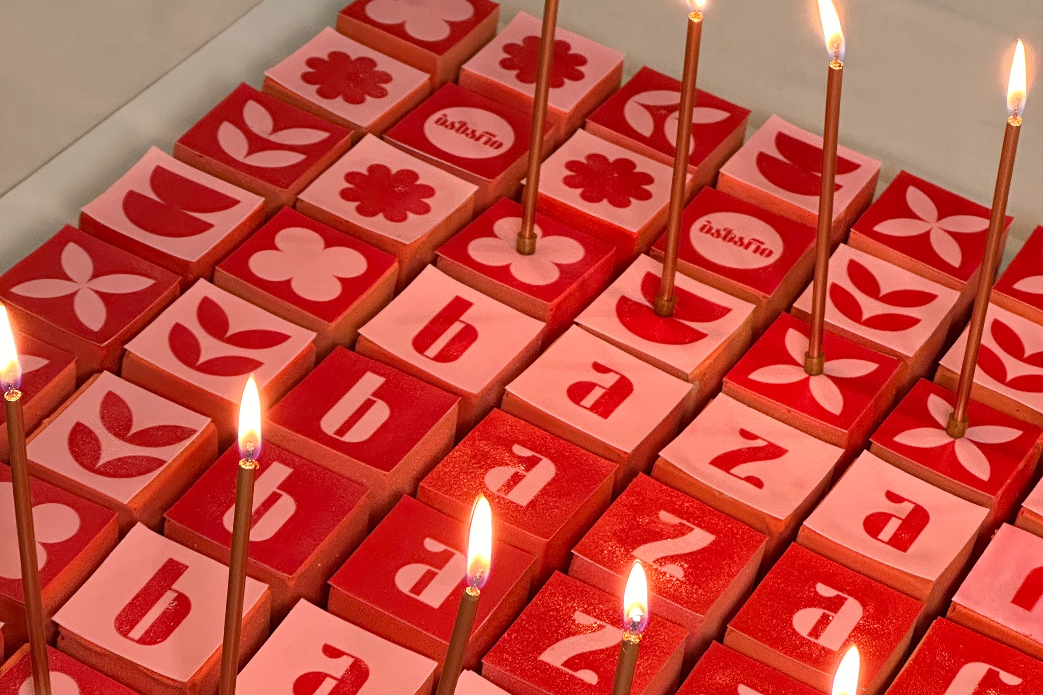
The new logo is sleek and contemporary — bold, geometric typography with high contrast, set in both Georgian and Latin scripts for international accessibility without losing local depth. The visual identity is energetic and warm, built on a rhythm of shapes and contrasts; its palette — Red Clay Qvevri and Soft Pink Blossom — evokes both earthiness and delicacy. The communication campaign carries that same warmth into every touchpoint, creating a sense of curiosity and everyday celebration around the variety on offer.




03/
Wayfinding
A simple, bold bilingual wayfinding system runs both inside and outside the building — helping visitors find the entrance, navigate between floors, and locate tenants with ease.